10 Essential Points for achieving a Non-Chaotic Vibrant Color Palette
How to achieve vibrant color without being chaotic
ART COMMUNITY
Eileen A Art
6/20/20255 min read
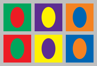
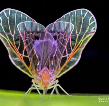
Complementary colors in the traditional RYB color model . Image Wikipedia Creative Commons
In response to a young girl that approached me while I was exhibiting my art at an art fair. Here goes this post.
Hey there young lady! I want to say how delighted I was to speak to you about art! As a young person, you’re already diving into the colorful world of art, and that’s something truly exciting. It doesn't matter if you are the spectator or the artist.
To achieve a color style palette you must practice, practice, practice, even when you reach 30 years of experience. Don’t be afraid to play with color. Mixing colors can create awesome results. If you’re using paints, try blending primary colors to create your own shades. Use a palette to test various mixtures until you find the right balance that embodies the vibrancy you seek. The unexpected hues that emerge can often become your standout colors.
“Vibrancy in color breathes life into artwork, making it stand out and resonate emotionally with the audience.”
Let me share some insights into how I achieve my vibrant color schemes, as this is a journey of exploration, experimentation, and a bit of guidance. Here are a few strategies that have helped me along the way:
Practice, Practice, Practice; The first and most important point to do art.
Like any other skill, developing a vibrant color palette takes time. Like 30 years! Just kidding, experimenting and learning is a must. Each piece you create will teach you something new, bringing you closer to mastering the vibrant colors that fills your heart. So, dive into the world of color without fear
Understand the use of color
Learn the Color Wheel! When you know how to combine color, you have the first step towards a great art piece. This is a classic tool as a guide, make it your best friend!
The use of complementary colors creates depth and contrast when they are together. The complementary colors are placed opposite to each other on the wheel. For example, pairing vibrant oranges with purple to achieve depth in your artwork.
Choose a color palette for your work
Having a specific color palette for your artwork will define your style, and it will reflect the emotions you wish to evoke in your viewers. For example; when I make an art piece, I want to convey the joy and happiness that the process of creating art brings to my life. Artists are always evolving and every experience influences and inspires your color palette. Be open to play and tweak your colors as you grow artistically.
Since I'm a person that embraces constant change, I have a brighter color palette! An accent that I love using are neon colors to give it more flavor. Some of my favorite color combinations that are present in my artwork are; Yellow + Fuchsia, Orange +Purple, and Teal + Fuchsia. These color palettes reflect happiness and joy of creating art.
Nature is the wonderful palette of vibrant colors.
Whether it's the vivid hues of a sunset or the bright array of flowers in a garden, take inspiration from your surroundings. Don’t just look at how colors interact but also how they change under different lighting. Making sketches or taking photos is a fantastic way to capture these colors. And if you don't have time to go outside, and are looking for a varied color palette that's what Pinterest is for. ;) visit my Pinterest board; A walk in the fairy garden, which will be linked at the end of the post.
Experiment with different materials
Not all mediums are created equal. Some pigments are naturally more intense and pure than others. For instance, using professional-grade acrylics or oils can make a significant difference in achieving that vibrant look. Additionally, mix with other mediums, like watercolor or ink, which can produce different visual effects and brightness.
Layering is key in building depth and texture. Start with a base layer of a muted color and gradually add brighter shades on top. This technique not only enhances vibrancy but also adds texture and complexity to your work, drawing the viewer’s eye in.
(And if you want to create the lightest color easily, use the white of the canvas base with a transparent color! This technique enhances the color).
Create Contrast
To truly make your colors pop, create contrasting areas in your artwork. This doesn’t just mean using opposites on the color wheel, it also involves varying saturation and brightness. A bright color next to a darker or more muted one creates tension and excitement, making the vibrancy appear even more pronounced. I have a cheat code that you can follow along;
Use the white of your canvas to your advantage to create light and no it doesn't matter that your canvas shows.
Cool colors go back they create depth and warm colors come forward
Dark colors go backwards, light colors come forward
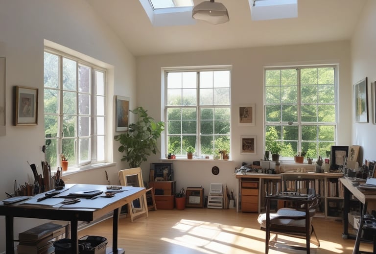
Natural Light
Lighting plays an essential role in how colors appear. Your work environment should be in natural light to achieve the best results and reveal the vibrancy of your pigments, while artificial light can alter how colors are perceived. Classically the light of a north facing window is the best for drawing or painting. This is how most of the art masters did. There was no electricity in their time. Personally, I have my studio in a north facing room.
Study Other Artists
Study the works of artists you admire. Pay attention to how they use color, what combinations they favor, and how they achieve vibrancy. Analyze their palettes. And then, with time, you will discover and develop your own color style.
Follow your gut
While techniques and theories are incredibly useful, art is all about expression. Don’t forget to trust your own instincts. If a color combination resonates with you, go for it! Often, the most personal and vibrant works come from listening to your intuition and diving into what feels right for you. People always engage with this type of work while interacting with them you can tell your story.
Tell your story
Remember, art is a joyful journey. (Well… at least for me) Speaking through your color palette is a part of that journey. Sometimes you're bright as the sun, other days dark as night. Tell that story in your art, let your imagination flow, create boldly and let your color palette speak for you, allow creativity to flourish through color and watch your unique “art style” shine.
Have Fun and create!
Colorful Links:
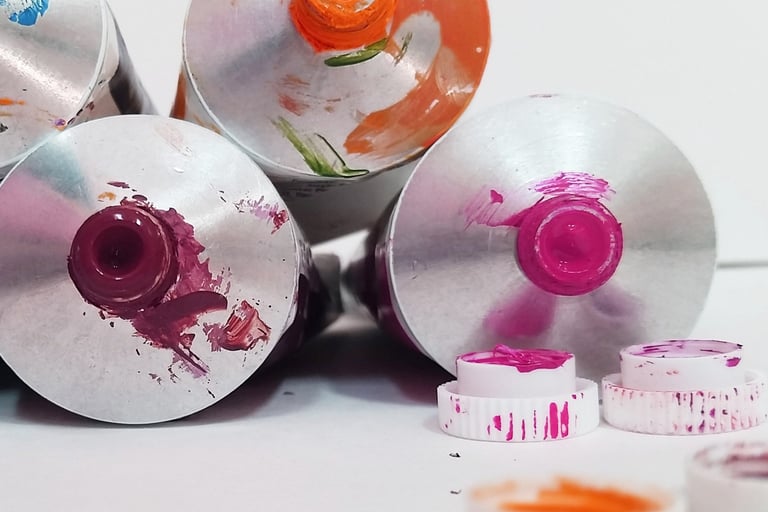
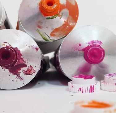


Picture showing 3 colors of Eileen A Art Color palette cadmium orange, permanent magenta and neon pink.
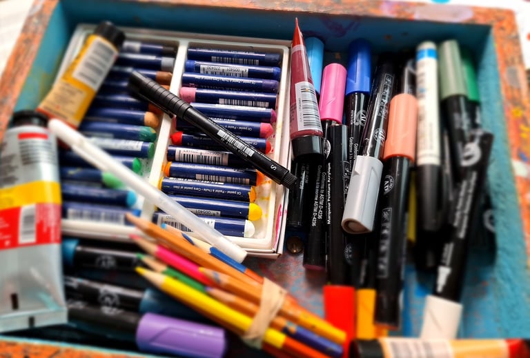
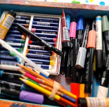
Experimental art materials acrylic watercolor pastels and ink pens Photo by Eileen A Art
Color Image Wikipedia Creative Commons
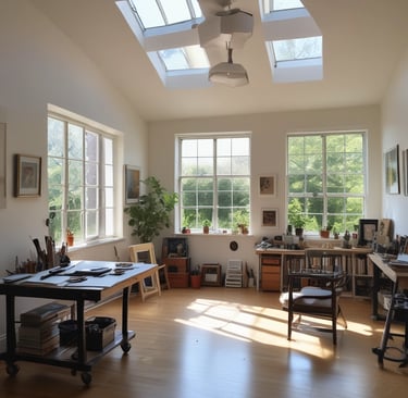
artist studio AI generated Photo
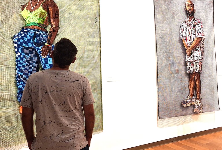
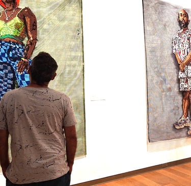
"Studying Other artist work" Photo by Eileen A Art
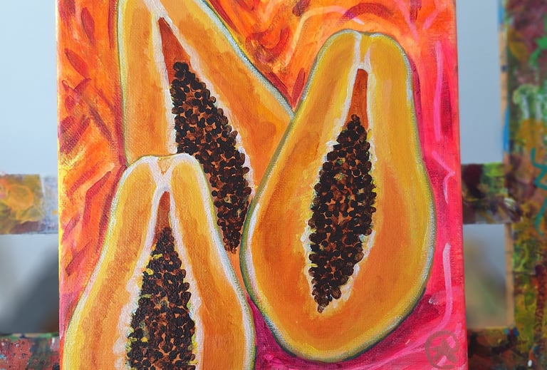
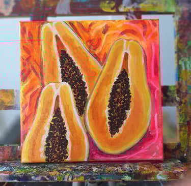
"I like this Papayas" Photo by Eileen A Art
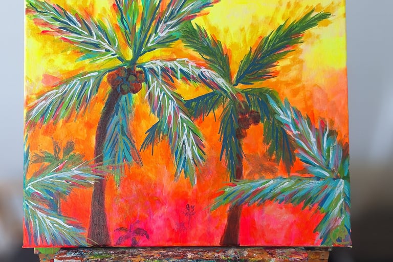
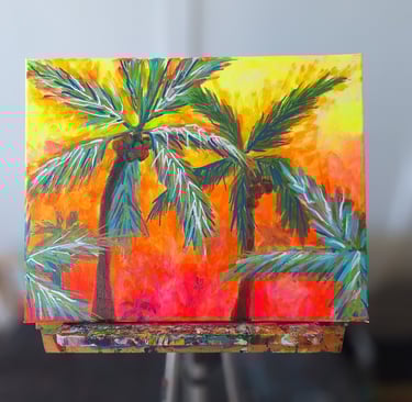
"Tropical palm trees" artwork by Eileen A Art
"Brighten Your Space with Joyful Original Art."
© 2014-2026. All rights reserved.
Get in touch with us to explore distinctive art pieces or for questions regarding commissions and exhibitions. We are excited to connect with fellow art lovers.
Join our prints waitlist here and Subscribe to Our Newsletter